Choosing the Right Visual Theme for Your Brand
The content of your brand—your story, service offering and so on—is unquestionably important. But perception starts with the eye, and before anyone engages intellectually with what you have to say, they will have a visceral reaction to the way your business looks.
So it’s vital to establish a visual theme that projects professionalism and reflects your vision for your practice. If you’re not sure where to start, read on.
Imagery
The first question you should ask when you’re considering the imagery to be used in your outward-facing collateral is, Who is my natural market?
If you offer a retail advisory service, you’ll likely picture typical client types in your imagery, including pre-retirees, professionals, business owners or any other groups you intend to target. If you’re providing an institutional or advisor-facing service, you may lean toward architectural or natural imagery.
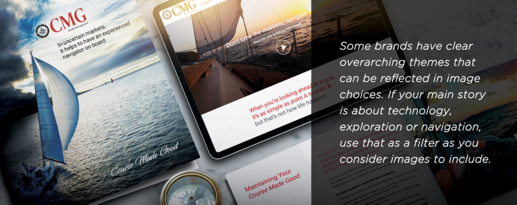
Some brands have clear overarching themes that can be reflected in image choices. If your main story is about technology, exploration or navigation, use that as a filter as you consider images to include.
You may also want to think about your competition. Do you want to avoid the types of shots you see everywhere? Are there firms you want to emulate and others you want to distance yourself from? In any case, remember that cheap or free images can drain credibility from your brand, but strong, professional images can instantaneously upgrade the look and feel of your collateral.
If you’re investing in team photography as well, see our post on photo sessions to get an idea of what to consider.
Colour and Tone
Whatever images you choose, they will be part of an overall look and feel that includes things like colours, fonts, white space, tones and styles.
It’s impractical to break all this down into a few sentences, but if you’re working with a professional team, make sure you share your preferences. Look at other brands, even from other industries, and make note of any that you identify with.

Think about what you want people to feel when they look at your business. Are you ultra-modern and tech-forward, warm and family-oriented, bold and creative, comfortable and personal? Getting a general idea of tone will help your brand partners home in on the right colours and styles for you.
It’s also worth noting that there’s no need to hold on to dated brand features just because you or your clients are used to them. Even in a brand refresh, you can take a leap forward and start presenting yourself the way you want to be seen.